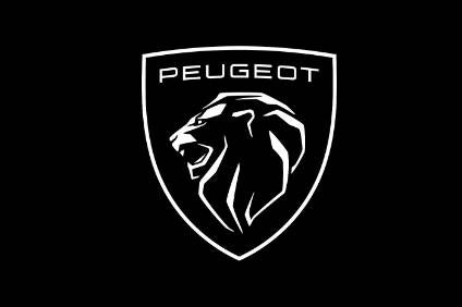
Peugeot has unveiled its new logo: a coat of arms ‘adorned with a magnificent lion’s head’.
Since 1850, Peugeot has had ten successive logos, all of which feature the lion’s emblem. Today an eleventh version has just been created by the Peugeot Design Lab, the Peugeot brand’s Global Brand Design studio.

Discover B2B Marketing That Performs
Combine business intelligence and editorial excellence to reach engaged professionals across 36 leading media platforms.
Launched in 2010, Peugeot says the current logo needed to change to crown the brand’s move upmarket.
The brand says the new logo embodies what Peugeot meant yesterday, what Peugeot means today, and what Peugeot will mean tomorrow.
This new coat of arms, in the effigy of the lion, has always been part of the brand, Peugeot points out and ‘this logo has been designed to last’.
Click on the below press release link if you wish to read the official full flowery description of what the new Peugeot brand logo stands for…


