
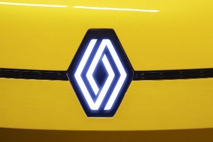
Hot on the heels of Kia, Renault has redesigned its logo – the diamond used by the brand since 1925.
First unveiled at the Renaulution event in January, the new diamond was displayed behind CEO Luca de Meo and used on the new 5 Prototype.
Go deeper with GlobalData
Discover B2B Marketing That Performs
Combine business intelligence and editorial excellence to reach engaged professionals across 36 leading media platforms.
The roll-out since then has been gradual, firstly with the New Zoe advertising campaign, and then across social media channels.
Gilles Vidal, Renault design director, said: "The diamond is one of the most recognised shapes in the world, and in the world of the automobile. It is a simple geometric shape, with a strong, powerful identity. The challenge was to renew this shape by giving it meaning, along with new, contemporary values to project the brand into the future."
Renault has changed its visual identity nine times, including this latest revision.
The current logo – created in 1992 and redesigned in 2015 – is being redesigned as Renault moves into a new era to meet the challenges of a modern international brand, with a significant focus on the digital world, the automaker said.
"By 2024, the entire Renault range will carry this new emblem," added Vidal.